Website Design & Digital Experience
Category: UX / Web Design / Brand
Role: Lead Designer
Tools: Figma · Webflow / Custom HTML · UX Architecture
Timeline: 4 Weeks
Status: Live Website
Overview
This project focused on designing and launching a brand-forward website to showcase products, communicate values, and convert interest into sales and inquiries. The goal was to create a digital experience that reflects the physical product quality while remaining simple, fast, and visually driven.
Problem
Many product-driven brands struggle with websites that:
Feel disconnected from their physical products
Overwhelm users with content
Lack clear conversion paths
Fail to communicate brand values effectively
There was a need for a website that balanced storytelling, usability, and conversion while maintaining a clean, coastal aesthetic.
Users
Primary users:
Surfers and ocean enthusiasts
Customers discovering the brand for the first time
Retail buyers evaluating products
Collaborators and partners
Key needs:
Quickly understand what the brand offers
See products clearly
Trust the brand’s quality and values
Easily find how to buy or get in touch
Research
Research methods included:
Reviewing competitor surf and lifestyle brand websites
Analyzing common navigation patterns in DTC brands
Observing how users scan product pages
Reviewing bounce and engagement patterns during iteration
Insights:
Large visuals outperform text-heavy layouts
Simple navigation increases product discovery
Clear brand story builds trust quickly
Fewer CTAs improve decision-making
Design Goals
Translate physical brand into a digital experience
Prioritize imagery over long-form text
Create intuitive navigation
Support both consumer and wholesale audiences
Optimize for mobile-first browsing
Information Architecture
The site architecture was designed around:
Clear separation between products and story
Fast access to portfolio and shop
Simple top-level navigation
Scalable structure for future product lines
Key sections:
Home
Portfolio / Case Studies
Products
Sustainability
Contact
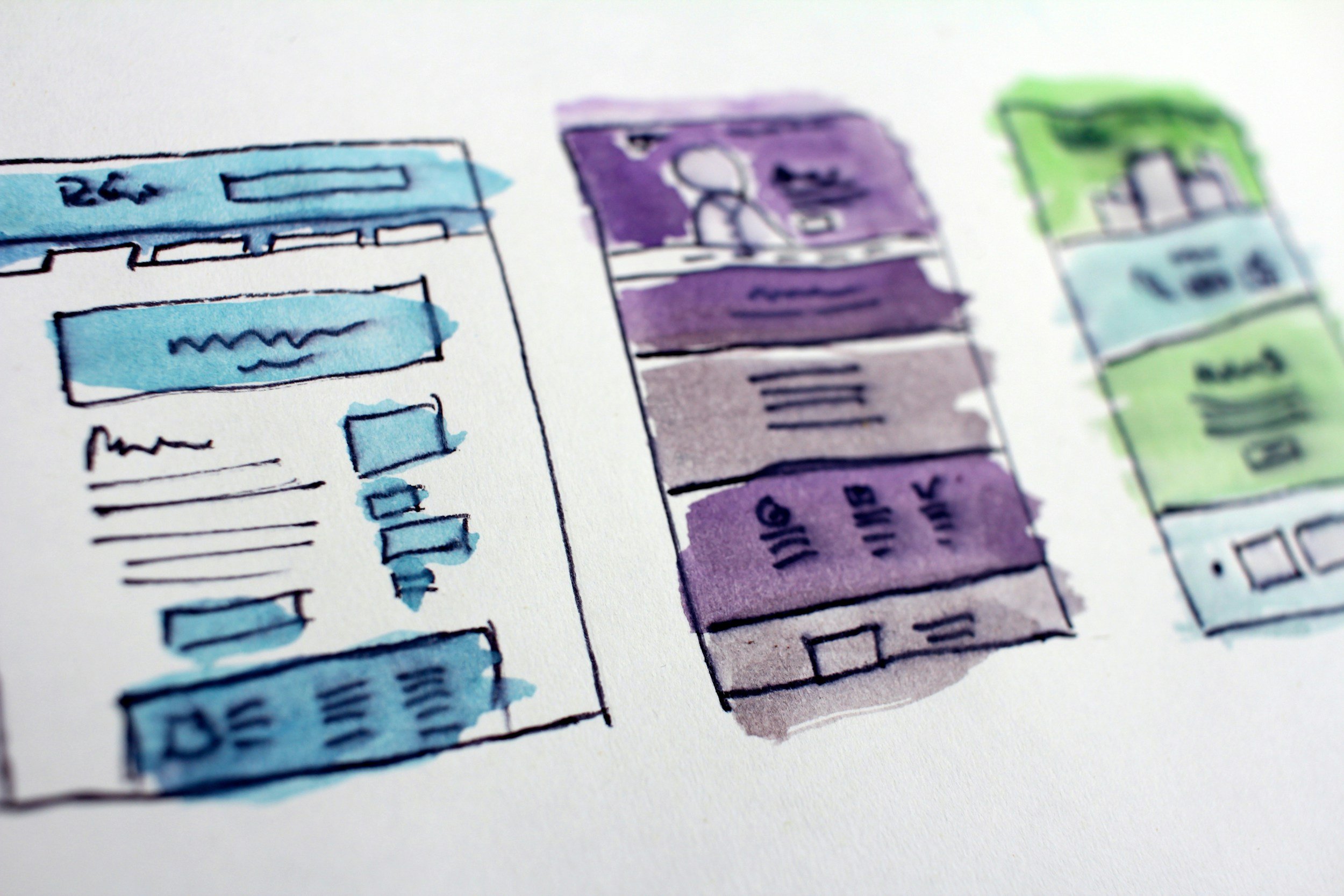
Wireframes & Layout Exploration
Low-fidelity wireframes explored:
Homepage hero structure
Product grid layouts
Case study storytelling formats
Mobile navigation patterns
Layouts were iterated to balance:
Visual impact
Scroll depth
Content hierarchy
Mobile usability
Prototyping & Build
High-fidelity prototypes were created to:
Test layout rhythm
Refine typography scale
Optimize image placement
Validate mobile behavior
The site was then built with:
Performance-focused layout
Lightweight components
Responsive breakpoints
SEO-friendly structure
User Testing & Iteration
Informal testing included:
First-time visitors navigating the site
Retail partners reviewing product clarity
Mobile users testing browsing flow
Key improvements from testing:
Simplified homepage messaging
Reduced navigation options
Larger product imagery
Clearer contact and inquiry paths
Final Design
The final website delivers:
Strong brand presence
Clear product storytelling
Mobile-optimized browsing
Simple, distraction-free navigation
Cohesive visual system across pages
Results & Outcomes
Increased clarity for first-time visitors
Stronger alignment between digital and physical brand
Improved engagement on product and case study pages
Scalable structure for future product and content growth