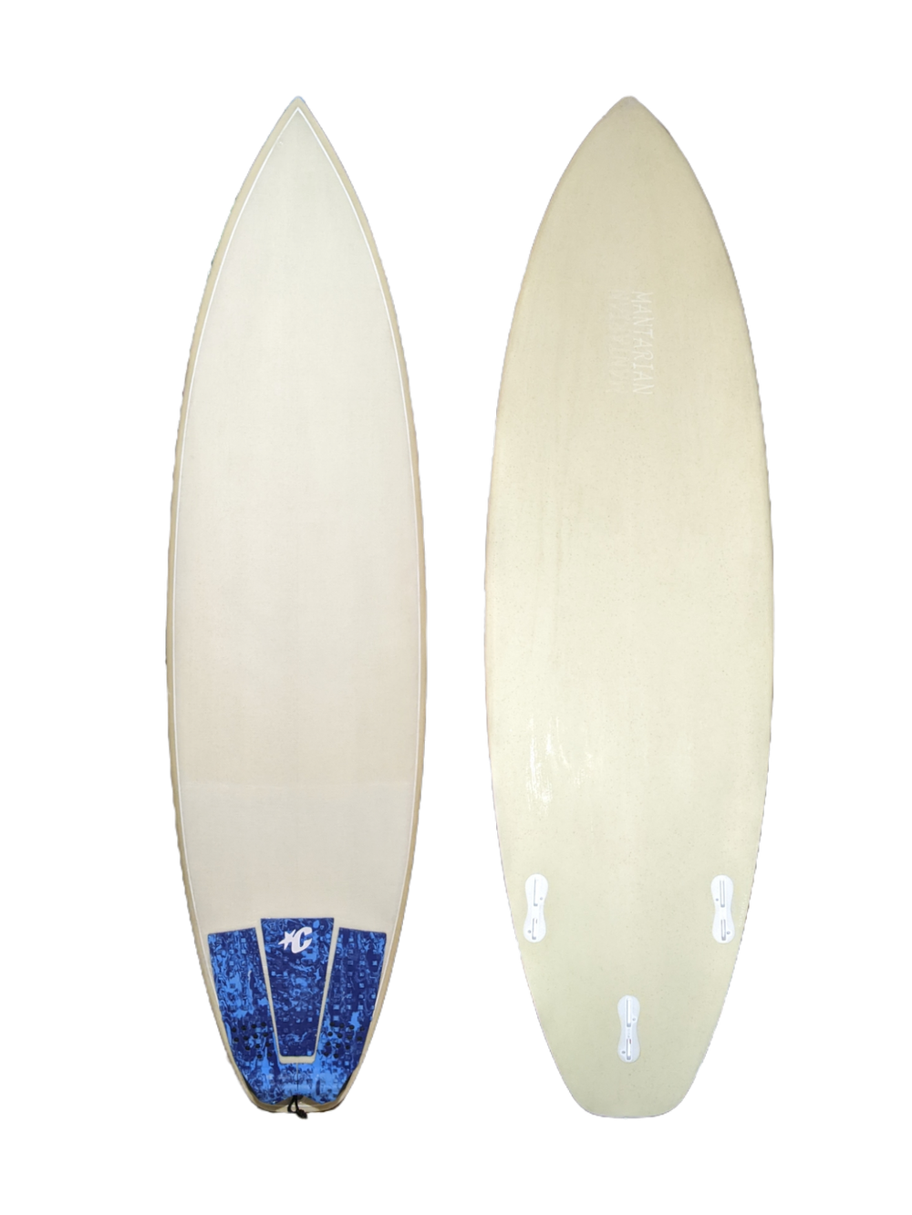
🏄♂️ Surfboard Design
Category: Product Design / Shaping
Role: Designer & Builder
Tools: Aku Shaper · CAD · SketchUp
Timeline: 6 Weeks
Outcome: Hand-finished performance board merging digital precision with craftsmanship
Overview
This surfboard project blends digital shaping precision with hands-on craftsmanship. The goal was to design and build a board optimized for small to mid-size waves — responsive, lightweight, and locally crafted.
Problem
Mass-produced boards often compromise on individuality and local wave performance. I set out to create a custom, high-performance surfboard tailored to both local conditions and rider preferences, while maintaining a clean, minimal aesthetic.
Research & Insights
- Speed: Better paddling power for softer waves.
- Durability: Lighter yet stronger material balance.
- Identity: Distinct, locally influenced shapes.
Design Process
1. Concept
Explored outlines inspired by mid-lengths and twin fins, balancing stability and agility. Sketches and CAD iterations refined rocker curves and volume distribution.
2. Digital Shaping
Using Aku Shaper, I digitally modeled the design, optimizing rocker curves and volume distribution for glide and turn response. Exported templates guided precision cuts and hand-shaping
3. Material & Build
Used epoxy resin and lightweight fiberglass for strength and flex balance.
Final Design
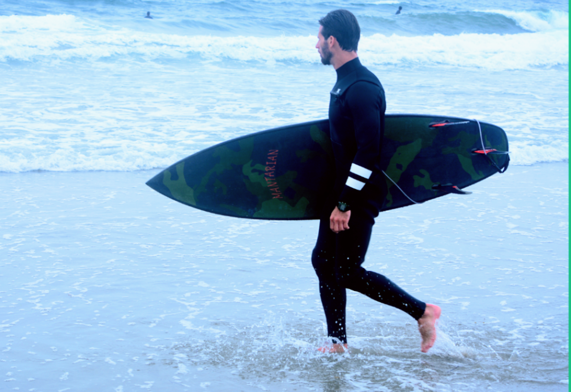
- Custom 6’2” board for waist–head high surf
- Hybrid outline for versatility
- Polished matte finish with minimal logo
- Balanced flex for drive and control
Results
- Fast, smooth performance in local conditions
- Positive rider feedback on paddle and control
- Featured in local surf design pop-up
- Showcased digital–craft design approach
Reflection
Designing and shaping this board highlighted how digital tools enhance craftsmanship rather than replace it. By merging precision modeling with tactile shaping, the result feels both engineered and alive — tuned for the ocean it was born from.
👕 T-Shirt Design
Category: Apparel / Brand Design
Role: Designer
Tools: Illustrator · Screen Printing
Timeline: 2 Weeks
Outcome: Locally inspired surf tee line blending minimal graphics with natural materials
Overview
This project explored how to translate coastal design language into wearable art. The goal was to design and produce a limited run of t-shirts that reflect local surf identity, focusing on minimal graphics, sustainable materials, and small-batch production.
Problem
Many surf tees rely on mass-produced graphics that feel disconnected from the local surf scene. I wanted to create something authentic to place — artwork that speaks to rhythm, tide, and simplicity, rather than overbranding.
Research & Inspiration
- Local surf breaks and topographic maps
- Vintage surf brand graphics
- Minimalist coastal design cues
Key insights: Locals prefer subtle over flashy designs; natural materials matter more than trends; small runs increase authenticity.
Design Process
1. Concept & Sketching
Explored hand-drawn linework inspired by wave forms and tide diagrams, focusing on balanced compositions for print.
2. Digital Design
Created vector graphics in Illustrator with a minimal 2-color palette. Used LightBurn for laser test prints on sample fabrics.
3. Production
Partnered with a local print studio for screen printing on organic cotton using water-based inks for a soft, eco-friendly finish.
Final Design
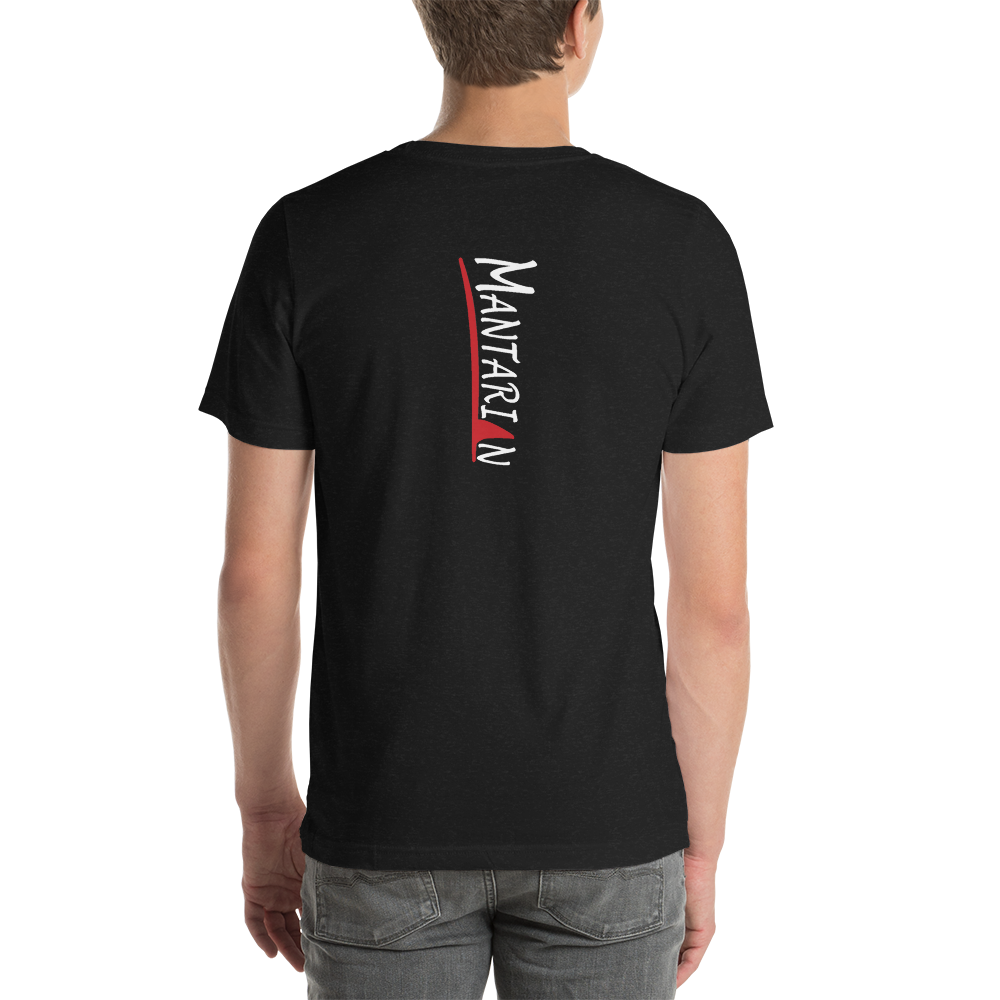
- Minimalist linework inspired by surf
- Hand-printed on 100% organic cotton
Results
- Featured in local surf shop
- Strengthened brand identity for Mantarian Designs / Max Wax
- Connected apparel to broader product design aesthetic
Reflection
This project demonstrated how apparel can extend a product brand’s story — blending minimal visuals, local craftsmanship, and sustainable values into a wearable design expression.
🌊 Tide Clock
Category: Product / UX Design
Role: Lead Designer
Tools: CAD · SketchUp · LightBurn
Timeline: 3 Weeks
Outcome: Functional, locally inspired tide-telling clock
Overview
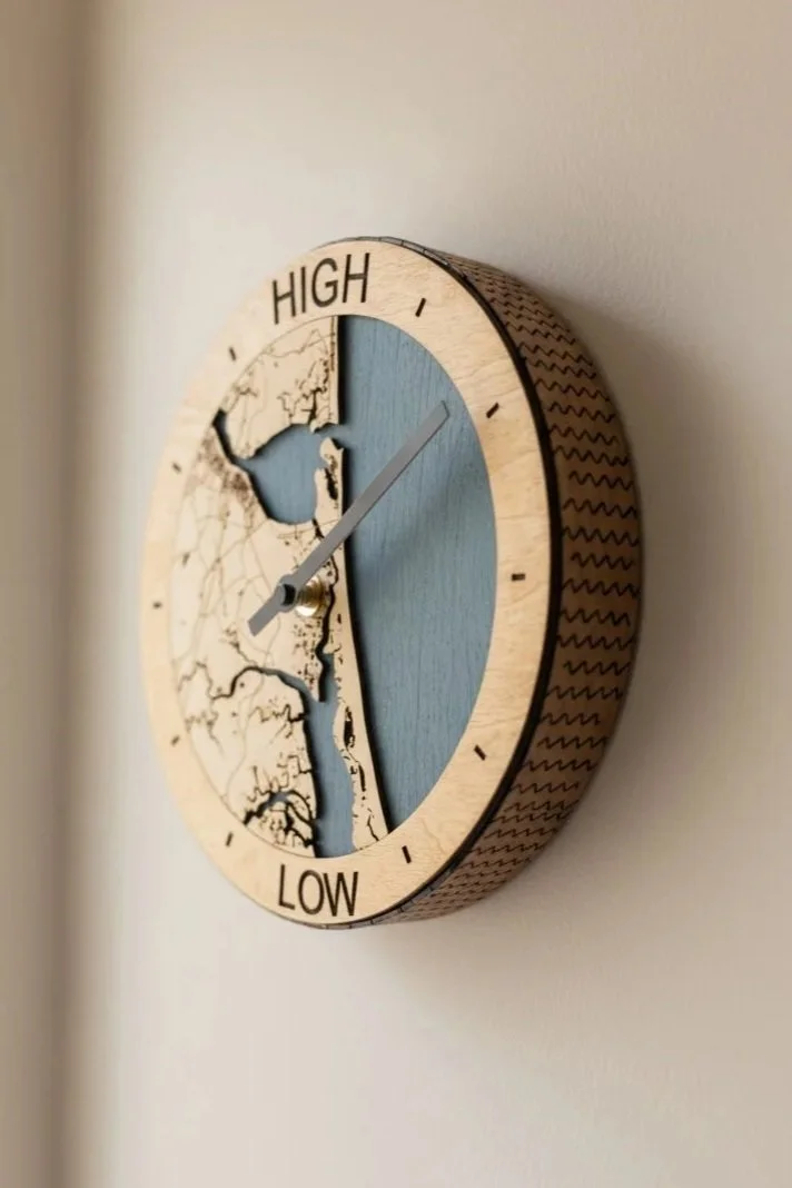
The Tide Clock is a locally designed tide-telling instrument that blends function, craft, and coastal identity. Created to simplify how surfers and ocean enthusiasts read local tides, the clock reimagines the experience in a tactile, analog form.
Problem
Most tide apps are cluttered and impersonal. They provide data but lack connection. I wanted to create a simpler, glanceable way to view tides — designed to feel at home in a coastal space, both functional and aesthetic.
Research & Insights
- Digital fatigue: Users check multiple apps for basic info.
- Desire for connection: Preference for physical tools tied to place.
- Design appreciation: Objects that look good stay visible and get used.
Design Process
1. Concept
Initial sketches explored forms inspired by nautical dials and surf culture — focusing on balance between precision and simplicity.
2. Prototype
Using CAD and SketchUp, I refined proportions, then laser-cut prototypes in LightBurn using local wood and acrylic.
3. Testing
Early users tested calibration accuracy and readability. Iterations improved contrast, typography, and hand movement for clarity.
Final Design
- Analog interface showing high / low / rising / falling tides
- Sustainable local materials
- Minimal wall-mountable form
- Clean typography and simple dial geometry