
Tide Clock
Category: Product / UX Design
Role: Lead Designer
Tools: CAD · SketchUp · LightBurn · Prototyping
Timeline: 3 Weeks
Status: Functional Prototype + Local Launch
Overview
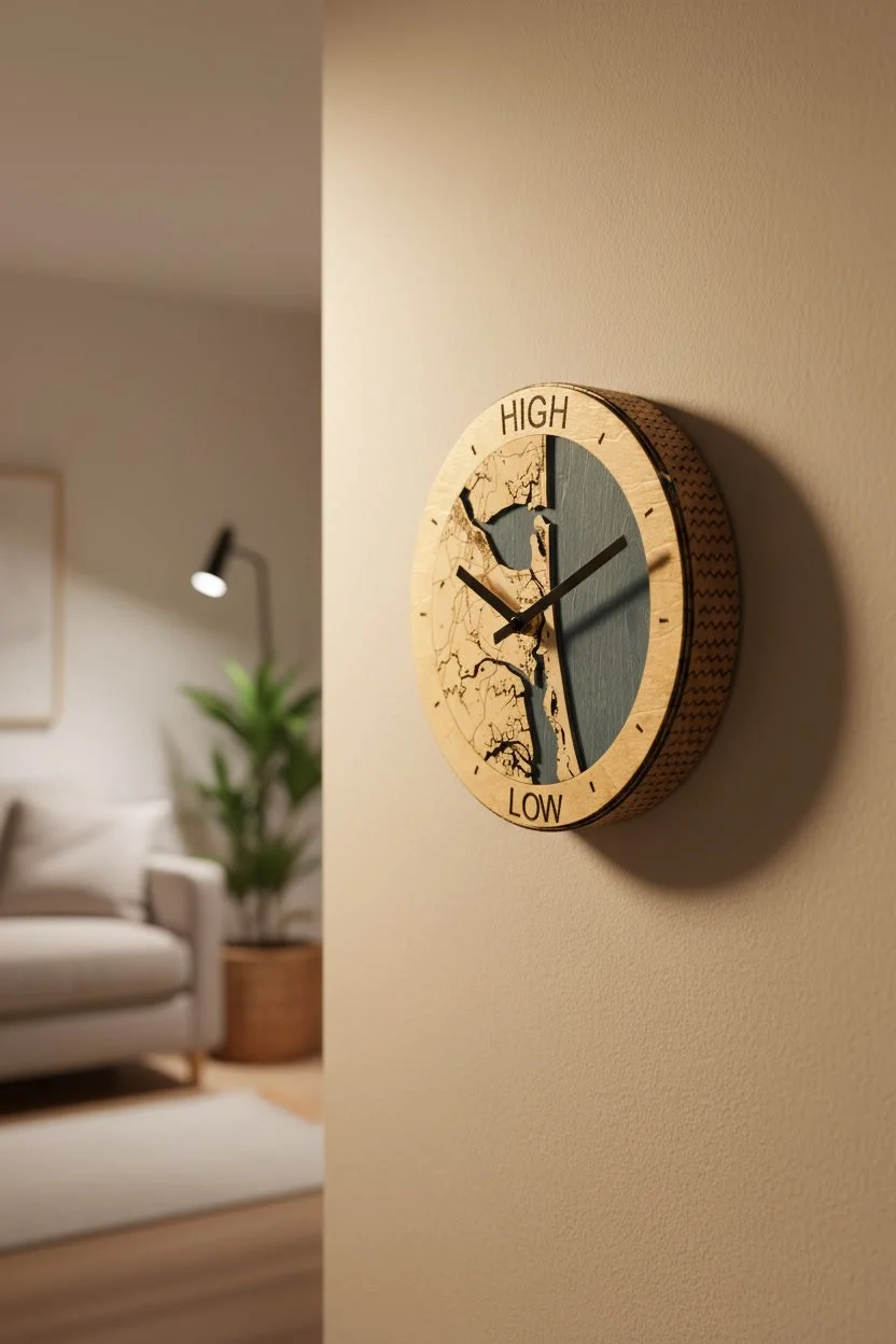
The Tide Clock is a locally inspired, physical-digital product designed to help surfers and coastal residents quickly understand tidal conditions without relying on apps or charts. The goal was to create an intuitive, beautiful object that blends local identity with practical ocean awareness.
This project combined product design, user research, rapid prototyping, and iterative testing to create a functional object that feels at home in coastal spaces.
Problem
Surfers and coastal users frequently need to check tide conditions, but:
Existing apps require unlocking phones and navigating charts
Printed tide charts are hard to read at a glance
Standard tide clocks lack local identity and often feel generic
Many users want ambient, passive awareness of tides in their home or shop
There was an opportunity to create a glanceable, locally meaningful tool that simplifies tide awareness while reinforcing coastal culture.
Users
Primary users include:
Recreational surfers planning sessions around tide windows
Coastal homeowners who want ambient ocean awareness
Surf shops and marine retailers displaying local conditions
Ocean enthusiasts who value functional coastal decor
Key needs:
Fast, glanceable tide understanding
Local relevance
Simple operation without digital friction
Aesthetic integration into home or shop environments
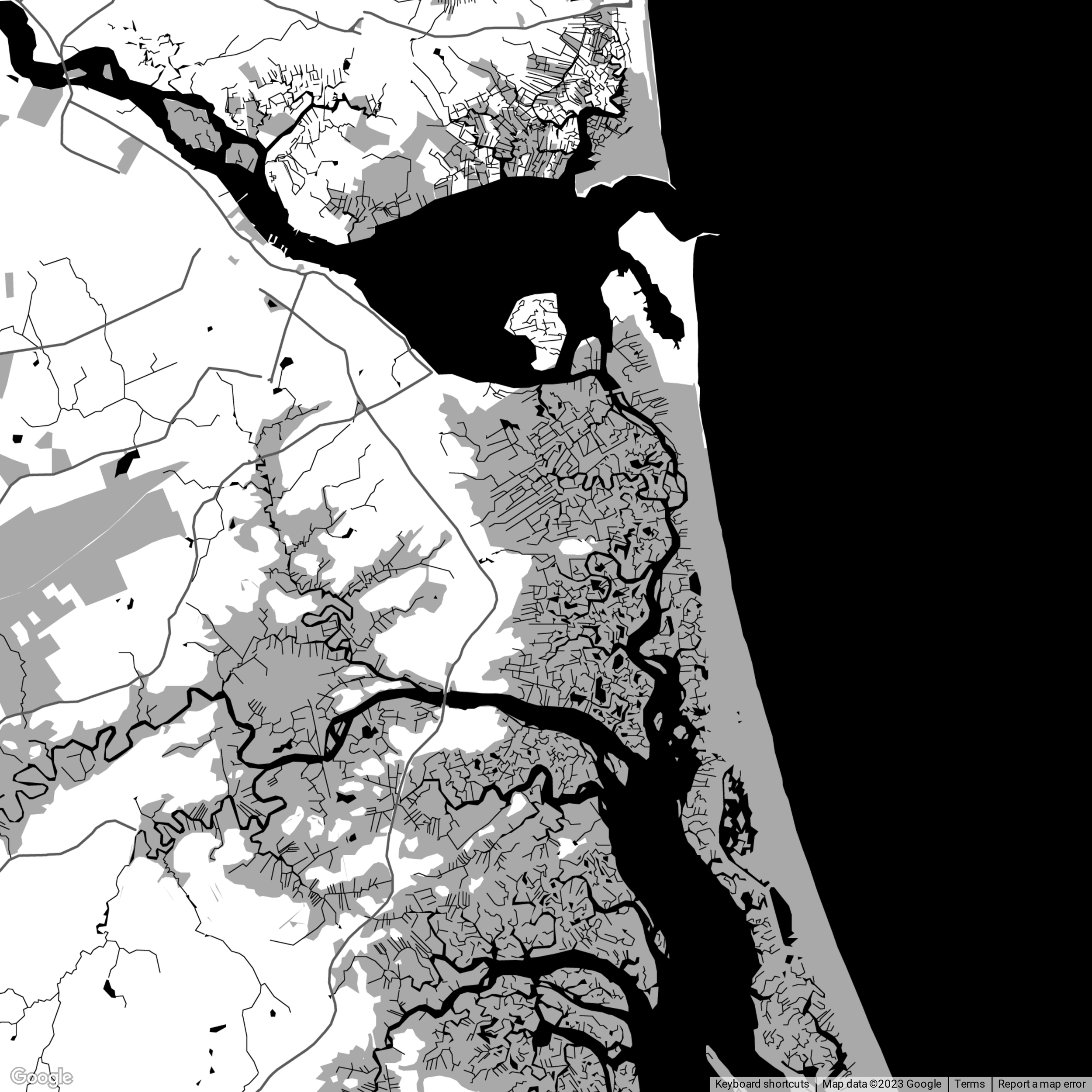
Research
Research was conducted through informal but targeted methods:
Conversations with surfers and shop owners about how they check tides
Observation of how users reference tide apps vs printed charts
Review of existing tide clock products and marine instruments
Analysis of common pain points with chart-based tide data
Key insights:
Users prefer quick visual cues over precise numerical data
Local identity increases emotional attachment to functional objects
Many users want passive awareness rather than active checking
Simpler displays lead to higher daily use
Design Goals
Make tide state understandable at a glance
Incorporate local geography for emotional connection
Create a non-digital, always-on reference tool
Maintain a handcrafted, coastal aesthetic
Allow for customization to different coastal regions
Design Architecture
The product system includes:
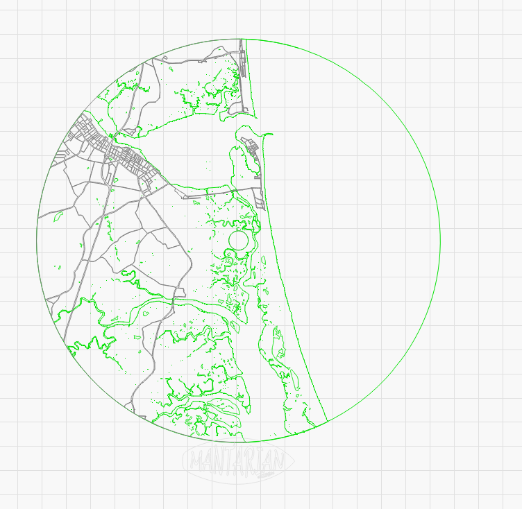
Laser-cut wooden face with local geography
Tide phase indicator hand
Clock movement calibrated to local tide cycle
Mounting and enclosure system
Customizable face artwork per location
The design was structured so the face artwork could be swapped to support different coastal towns without redesigning the full product.
Ideation & Sketching
Early ideation focused on:
How to visualize tide state simply
How to integrate geographic landmarks
Balancing clarity with aesthetic minimalism
Multiple layout concepts were sketched and prototyped to test:
Hand length and readability
Label placement
Visual hierarchy between time and tide state
Map detail vs legibility
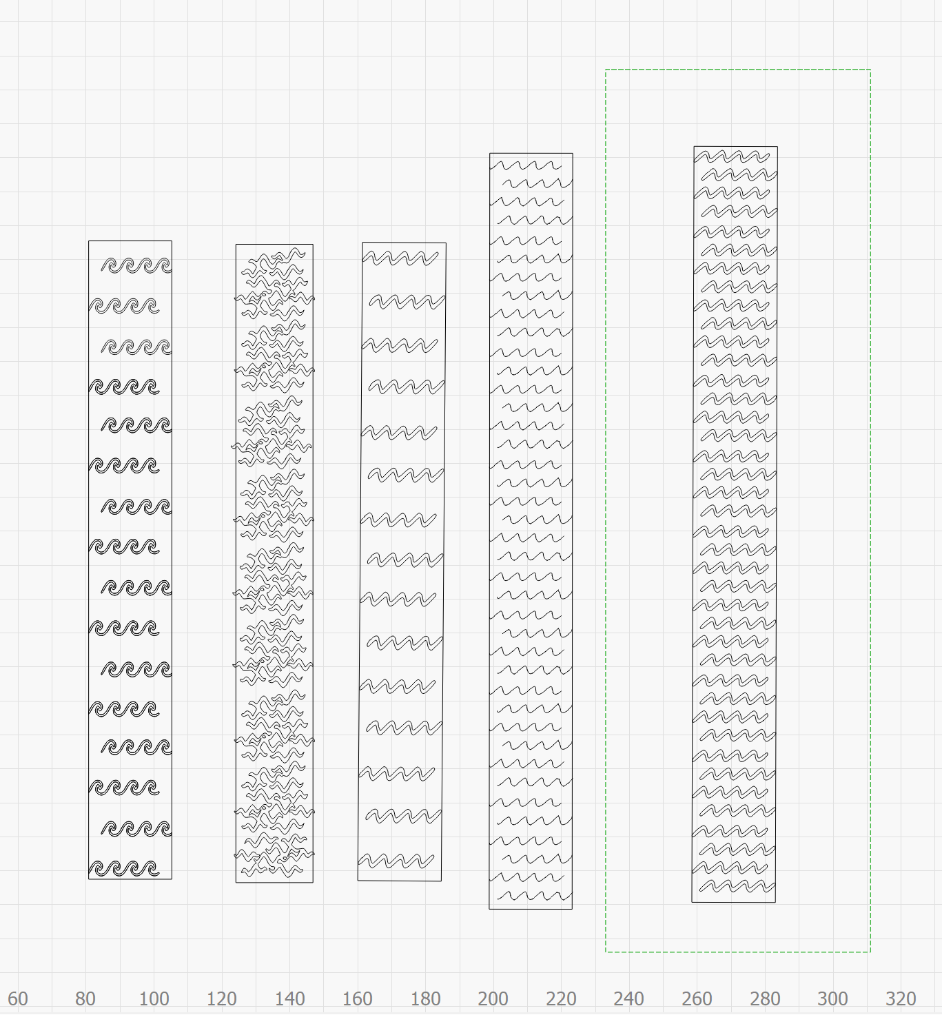
Prototyping
Rapid prototypes were created using:
CAD for face layouts and tolerances
Laser-cut plywood and hardwood samples
Off-the-shelf tide clock movements
Iterative face designs to test readability
Each prototype was tested for:
Visual clarity from a distance
Ease of understanding for first-time users
Material finish and durability
Mounting and assembly workflow
User Testing
Informal user testing included:
Surfers interpreting tide state without explanation
Shop owners evaluating wall placement and readability
Non-surfer users assessing intuitive understanding
Key findings:
Users preferred simplified labeling over technical terms
Larger visual markers improved quick comprehension
Local map details increased perceived value
Some users wanted less clutter for faster scanning
Changes made based on testing:
Simplified labeling
Increased contrast on tide indicators
Adjusted hand size for better visibility
Refined map detail for balance between art and function
Final Design
The final Tide Clock features:
Laser-cut wooden face with local coastline
Smooth, non-ticking movement
Clear tide phase indicators
Minimal labeling for quick scanning
Customizable geography per location
The result is a functional coastal instrument that blends product design with local storytelling.
Results & Outcomes
Successfully produced functional prototypes
Positive feedback from surfers and coastal users
Interest from local retailers for region-specific versions
Validated demand for customizable, location-based designs
Established a repeatable system for expanding to new coastal markets